Imagine being given a photo of Italian art to use as design inspiration.....how would you handle it? Would you use the imagery as it is - a realistic portrayal? Would you take pieces or elements of the photo and go from there? How about colours....or size? So many choices, so many decisions!
A few months back I was invited to create a piece of textile art based on "The Annunciation" by Fra Angelico......as a group of artists we were each given a different art work to use as a "jumping off point" for our own work. I'm not sure what images the others were given but since the exhibition is at the Italian Cultural Centre in Vancouver, I imagine the art was all Italian.....haha!
After some reflection I realized that I really had never used figures or people in my work and I didn't want to start doing so......amidst all the design work I wanted to explore how this piece might be come a beginning for a new series. I had taken masses of photos during my recent walk on the Camino de Santiago and had some great interior shots of the cathedrals I had visited:
So then I started to focus on the building part of the artwork - the figures appear to be in a "cloister" which is generally "a covered walk in a convent, monastery, college, or cathedral, typically with a wall on one side and a colonnade open to a quadrangle on the other". It was beginning to make sense for me...look up to the soaring arches of the space above>
I wasn't sure about the columns, so those were eliminated. I was working at simplifying the design to some very basic shapes.
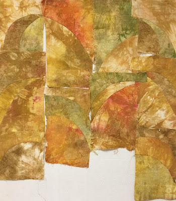
I'm looking now with the idea of construction - how am I going to put it all together? As my career began as a traditional quilter, I'm familiar with a wide variety of piecing methods so I decided a "stack, slash, shuffle" method was the best choice. the widths of the sections would be the same but I could work with different lengths and thereby achieve a variety of rectangles and get some visual interest going....
The fabric had been chosen a while back, luscious hand dyed vintage linen with wonderful drape to it - a little on the heavy side but I knew the texture and thread count would be perfect.
Construction began and went smoothly - put together in less than a day.
And so "In the Cloister" heads off for the exhibition shortly and the shapes, imagery and design will be considered for the future, perhaps this winter would be a good time to begin!
 |
| In the Cloister |
I hope you'll join me at the Exhibition Opening - September 12th at 7pm. at the Italian Cultural Centre in Vancouver.


1 comment:
hi Susan thanks for sharing your process. All very intersting, helpful, effective, and creative! As I was just in Italy for a month and also love Spain (2 trips there) working with the architectural design elements is very appealing! I will definitely go to the Show when I am in Vancouver in late September. Valerie
Post a Comment